Uniforms pet-peeves

The forum for ranting, raving, complaining and praising
Post Reply
Spider John
Hall Of Famer
Posts: 10952
Joined: May 18 06, 10:09 pm
Location: East of the middle of West Tennessee

Re: Uniforms pet-peeves

Post by Spider John »

Radbird wrote:How could anything be worse than these?
Image
There's a couple of fast-ballers. Wonder how the Astros would have fared if JR Richard hadn't had a stroke and they held on to Ryan.

Talking about being green, I printed an e-mail the other day that required two pages. It would have only needed one page, but for the sig at the end of the e-mail saying to be green and don't print th e-mail unless necessary.

MrSaigon

Re: Uniforms pet-peeves

Post by MrSaigon »

JL21 wrote:
MrSaigon wrote:I'm ready for the Mariners to shake things up. Not a fan of their colors.
Interesting. I actually kind of like those (other than the teal bill). It could probably stand an update, but I like that it's a newer uniform/logo scheme that looks like it could have existed 50 years ago.
It's the teal accents I don't like. The navy blue is good. The compass is kind of cool. Mostly it's the teal.

User avatar
Fat_Bulldog
likes to grate his own cheese
Posts: 12878
Joined: May 9 06, 12:41 pm
Location: Drunk

Re: Uniforms pet-peeves

Post by Fat_Bulldog »

What's the deal with Boston's new "away" uniform this year? All blue letters and numbers. Anyone else notice this?

User avatar
JL21
NPR & THT Contributor
Posts: 36109
Joined: April 18 06, 7:44 am
Location: Chocolate City

Re: Uniforms pet-peeves

Post by JL21 »

Fat_Bulldog wrote:What's the deal with Boston's new "away" uniform this year? All blue letters and numbers. Anyone else notice this?
Yeah, I don't really like it.

Image

MrSaigon wrote:
JL21 wrote:
MrSaigon wrote:I'm ready for the Mariners to shake things up. Not a fan of their colors.
Interesting. I actually kind of like those (other than the teal bill). It could probably stand an update, but I like that it's a newer uniform/logo scheme that looks like it could have existed 50 years ago.
It's the teal accents I don't like. The navy blue is good. The compass is kind of cool. Mostly it's the teal.
Given that it's the emerald city, they could pretty easily swap it with a deeper green and it would mix well with the blue.


User avatar
Fat_Bulldog
likes to grate his own cheese
Posts: 12878
Joined: May 9 06, 12:41 pm
Location: Drunk

Re: Uniforms pet-peeves

Post by Fat_Bulldog »

JL21 wrote:
Fat_Bulldog wrote:What's the deal with Boston's new "away" uniform this year? All blue letters and numbers. Anyone else notice this?
Yeah, I don't really like it.

Image

MrSaigon wrote:
JL21 wrote:
MrSaigon wrote:I'm ready for the Mariners to shake things up. Not a fan of their colors.
Interesting. I actually kind of like those (other than the teal bill). It could probably stand an update, but I like that it's a newer uniform/logo scheme that looks like it could have existed 50 years ago.
It's the teal accents I don't like. The navy blue is good. The compass is kind of cool. Mostly it's the teal.
Given that it's the emerald city, they could pretty easily swap it with a deeper green and it would mix well with the blue.
The deeper green would be awesome.

I definitely don't like the new Boston road unis.

User avatar
JL21
NPR & THT Contributor
Posts: 36109
Joined: April 18 06, 7:44 am
Location: Chocolate City

Re: Uniforms pet-peeves

Post by JL21 »

The Brewers did it back in the 90's and it looked kind of bad. But I think it looked bad because they threw in gold.

http://www.sportslogos.net/logo.php?id= ... 1iyesgcgs1

User avatar
Fat_Bulldog
likes to grate his own cheese
Posts: 12878
Joined: May 9 06, 12:41 pm
Location: Drunk

Re: Uniforms pet-peeves

Post by Fat_Bulldog »

JL21 wrote:The Brewers did it back in the 90's and it looked kind of bad. But I think it looked bad because they threw in gold.

http://www.sportslogos.net/logo.php?id= ... 1iyesgcgs1
It didn't fit with their scheme.

Just the navy with a dark "emerald" green could make for a very classic looking, new uniform scheme for the Mariners.

Nothing was as bad as the original Devil Rays or Diamondbacks unis.

User avatar
TheoSqua
Next Gen Wart
Posts: 8951
Joined: April 22 06, 6:53 pm
Location: St. Louis
Contact:

Re: Uniforms pet-peeves

Post by TheoSqua »

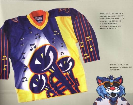
Let's not forget this baby:
Image

User avatar
Tambourine Man
accepts no jimitators
Posts: 11413
Joined: April 21 06, 3:31 pm
Location: I Read the News Today Oh, boy

Re: Uniforms pet-peeves

Post by Tambourine Man »

I like that blue on the BoSox uni quite a bit more than red.

User avatar
Radio_Bugtussle
Perennial All-Star
Posts: 3450
Joined: July 26 06, 9:51 am
Location: Searching for the perfect microbrew

Re: Uniforms pet-peeves

Post by Radio_Bugtussle »

TheoSqua wrote:Let's not forget this baby:
Image
Hey look!

Keenan actually did something intelligent while he was mismanaging the Blues... :shock:

Post Reply